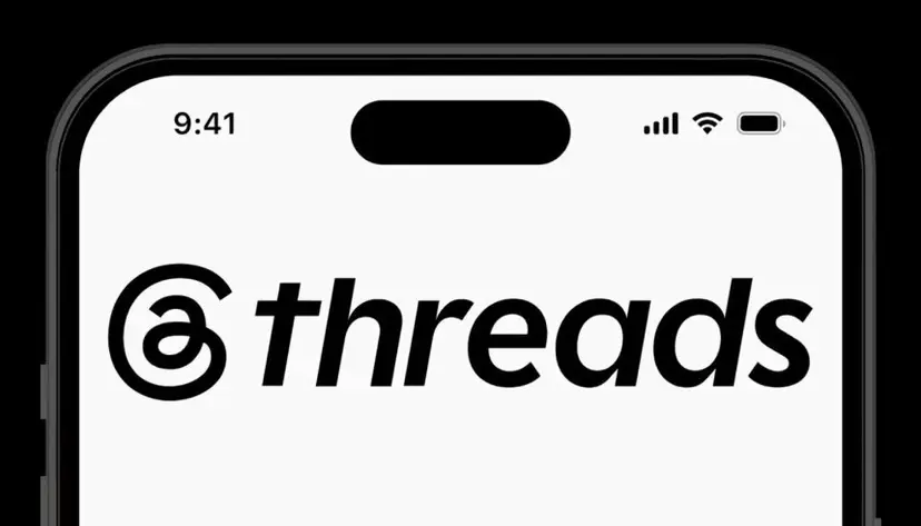
[비즈한국] Meta's text-based social media platform, Threads, has undergone a rebranding three years after its launch. Moving away from sharing Instagram's existing design assets, Threads has emphasized its independence by introducing a unique logo and wordmark. This rebranding is interpreted as a strategic move to shed the image of being an Instagram side project and to engage in full-scale competition with X (formerly Twitter).
Evolving into an 'Independent Platform' Beyond Instagram
When it was first created, Threads based its logo and watermark on 'Instagram Sans,' the dedicated typeface for Instagram. However, Threads has grown significantly, reaching 141.5 million global mobile daily active users (DAU) as of January this year, surpassing X's 125 million to become the number one text-based SNS. Concluding that the time had come to establish a brand identity worthy of its status, Threads changed its logo and watermark on May 11.
The most prominent feature of the newly unveiled logo and wordmark is their rightward tilt. This applies an 'Oblique' style, where the Sans font is slanted. Additionally, the watermark incorporates 'Chiseled Cuts,' where the ends of the letters are angled and carved like sculpture, allowing users to identify Threads at a glance even outside the app.
The Threads design team stated that they chose italics because they align well with the forward-looking energy of conversations on Threads. Christopher Clare, Head of Design at Threads, mentioned on his Threads account, "The previous logo using Instagram Sans felt inherited and static. We wanted to differentiate from Instagram, and we felt that italics could create a uniqueness specific to Threads."
A Preview of Dynamic and User-Friendly Changes
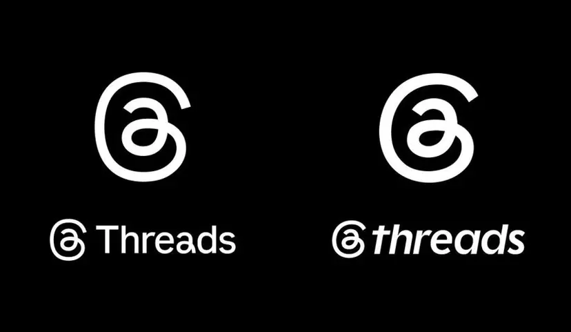
Domestic typography experts analyzed that this rebranding of Threads brings major changes to its typeface. Park Yoon-jung, a professor of visual design at Kookmin University, explained, "The previous watermark followed Instagram's typeface, such as using a double-story lowercase 'a'. The updated wordmark has changed to a single-story Geometric Sans family, where 'a' and 'd' share similar shapes."
Geometric Sans is a typeface that gives a mechanical and schematic feel. Professor Park analyzed, "I see an effort to provide both casualness and a sense of speed by changing the uppercase 'T' to a lowercase 't' while retaining the schematic feel characteristic of the Geometric family."
Kwon Kyung-seok, a director at Sandoll, noted that this rebranding enhances user-friendly sensibility. Director Kwon commented, "Oblique is a typeface that reflects the natural tilt when humans write. That tilt provides a dynamic feeling and is a form that better fits human writing sensibilities." He also added, "It is positive that they maintained a thinner weight rather than an overly bold typeface to optimize for the mobile environment."
Critiques on Lack of Individuality and Narrow Kerning
Despite the perception of a successful rebranding, some points of concern have been raised. Professor Park pointed out that this design change follows the recent trend of adopting a Sans style. "So many brands are switching to Sans typefaces these days that they are losing their individuality," Park remarked.
Director Kwon noted the narrow kerning of the watermark. "It seems they narrowed the space between letters to increase the readability and prominence of the watermark," Kwon analyzed. "The kerning is tight, and the space between 'h' and 'r' is particularly narrow, creating a somewhat stifling feeling."
This rebranding is read as Meta's intent to foster Threads no longer as an Instagram side project, but as an independent platform competing on equal footing with X. This is supported by the fact that the rebranding occurred in the third year of service, a time when the user base has reached a stable trajectory.
Head of Design Clare emphasized, "It's been nearly three years since Threads was launched as an Instagram side project. Now, we needed a refresh that reflects our brand identity and the direction we want to head—a 'new and independent era.'"