

[비즈한국] Woowa Brothers, the operator of Baedal Minjok (Baemin), which has established itself as Korea's leading food delivery application since its launch in 2010, has unveiled the first results of its 'Baemin 2.0' rebranding project. To minimize the sense of unfamiliarity for customers, the company plans to replace its brand design incrementally rather than all at once. First, a new mint color with higher, near-fluorescent saturation and a proprietary typeface named 'Work' have been revealed.
The font primarily used by Baemin in the past was the 'Hanna' font, which recreated the wonky, hand-painted lettering found on vintage street signs. In a market for proprietary fonts that mostly pursued precise stroke processing and high readability, the impact of Hanna—which embraced imperfection as a concept—was immense. It is fair to say that the origin of the so-called "B-grade" fonts currently on the market is effectively the Hanna font. Furthermore, even though Baemin has no direct connection to the font industry other than being an IT-based service, it has released various fonts every year, such as Hanna, Jua, Yeonsung, Euljiro, and Geulrim. This shows that typography occupies a significant portion of the company's identity.
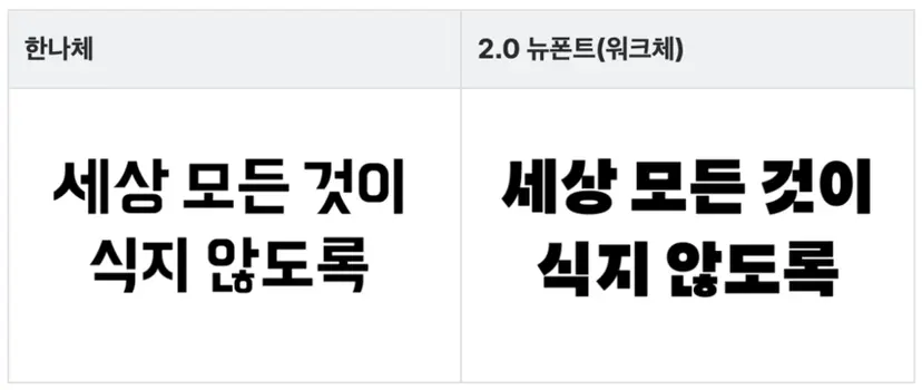
The 'Work' font, the new face of the brand, features 'ㅅ', 'ㅈ', and 'ㅊ' characters with diagonal strokes typical of gothic styles now flattened into vertical and horizontal lines. If the Hanna font created irreplaceable character by breaking the internal rules of typography, the Work font follows a design formula of basing itself on a versatile gothic style while differentiating itself with one or two heavily stylized character components. It feels like a free-spirited soul entering the mainstream. Even the name of the font isn't a person's name like 'Hanna'—it’s the structured, disciplined 'Work'.
Upon opening the Baemin app, I noticed some shortcomings alongside the freshness of the Work font. The Work font is a rather thick gothic typeface, and perhaps due to conceptual choices or a tight development schedule, the weight distribution of the strokes is not properly balanced in some characters. This feeling is reinforced when looking at the 'ᆭ' (n-h) batchim (bottom consonant cluster), which seems awkwardly positioned between the Hanna aesthetic and a standard gothic style. In the character '록' (rok), the final consonant 'ㄱ' is positioned too low. Even considering the weight of the 'ㄹ', it would have been better to raise the center of gravity.
There are also questions regarding the expansion of the font family. The flattened diagonal strokes of the Work font are a design that compensates for the simplicity of the strokes with sheer thickness. Because the strokes only derive their form from thickness and lack inherent structural strength, they will likely lose their distinct character as they are thinned out into Medium or Light versions in the future. New structural solutions will be needed then.
Overall, the quality of the Work font is not low. In particular, words like '선착순' (first-come, first-served) showcase the beauty of the Work font well as the distinctive 'ㅅ' and 'ㅊ' components harmonize. However, because font design is a task where raising the level of the most difficult and awkward strings—rather than focusing on the best-looking ones at the front—is crucial, several areas of disappointment stand out more prominently.
Baemin's newly presented mission is "ensuring nothing in the world goes cold," and its goal is to become an "irreplaceable delivery platform that provides everything you want in real time." This implies the potential for business expansion beyond just delivering food or groceries. The Work font, designed to be neater and more usable than the Hanna font, is important in that regard. Although the Work font is not perfect, I believe it will continue to improve if it is used for as long as the Hanna font was. Where will Baemin 2.0, accompanied by the Work font, head next? Also, in a situation where the B-grade font concept has effectively been discarded, I am curious if the tradition of releasing new fonts almost every year will continue, and if it does, whether it will remain B-grade or follow this new, structured style.
About the author, Han Dong-hoon:
A type designer. He is interested in all fields related to letters, including writing, calligraphy, typeface design, and teaching. He currently designs various corporate proprietary fonts and commercial fonts at the type studio AlignType. He has contributed to publications such as 'Monthly Design' and the quarterly 'Design Review,' and conducts typography design lectures on various online and offline platforms. In 2021, he published the essay collection 'The Universe in a Letter.'