

[비즈한국] The official emblem (logo) of the Presidential Office has reverted from a design featuring the Yongsan building to one that includes the Blue House (Cheongwadae). For 74 years since the establishment of the government in 1948, the life and official duties of the President of South Korea took place at the Blue House. Because of its importance, the name 'Cheongwadae,' which means 'house of blue tiles,' was used synonymously with the President or the Presidential Secretariat, transcending its role as a mere name. Due to its immense influence, the promise to relocate the Blue House appeared consistently since the civilian government era, but it was never realized due to many realistic difficulties.
However, former President Yoon Suk-yeol, who took office in 2022, announced a plan to move the presidential office to the Yongsan Ministry of National Defense building just ten days after his election. It was a rapid speed reminiscent of a military operation. Because of the hasty process, which cast doubt on whether sufficient review had taken place, there were even rumors that the office relocation was based on the unofficial advice of a fortune-teller rather than the stated reason of strengthening communication with the public.
The Yoon Suk-yeol administration, which moved the presidential office to the Yongsan building, also changed its official emblem (logo). Instead of the existing Blue House silhouette, the new logo added a phoenix and a mugunghwa (Rose of Sharon) to the front view of the Presidential Office building. Some suggest a connection to former President Yoon Suk-yeol's background as a prosecutor, noting that the building shape resembles the current symbol of the Prosecutors' Office, but there is no evidence for this. The logotype for 'Office of the President of the Republic of Korea' continues to use the government symbol font developed in 2016.
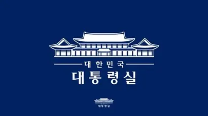
From the moment of its announcement, the relocation of the presidential office was mired in constant controversy, involving complex issues such as the reconstruction of security systems inside and outside the office built over decades, lack of space, confusion regarding commuting due to the separation of the residence, the expansion of the presidential staff, and the rushed opening of the Blue House. Therefore, it was only natural for the Lee Jae-myung administration, which was launched following an early presidential election due to impeachment, to declare a return to the Blue House. The new logo was unveiled in line with this shift.
The newly released Presidential Office logo seems to reflect the transitional phenomena of impeachment, early election, and inauguration. The symbol now features the Blue House instead of the Yongsan building, but because the office is still located in Yongsan, the logotype reads "Office of the President." The design itself appears unrefined. It seems intended to convey a clear impression with high stroke contrast and sharp, polished protrusions, but it feels unnatural.
What many point out is the letter spacing (kerning). In '대통령실' (Presidential Office), the gap between '대' (dae) and '통' (tong) is noticeably tight. This seems to be because '대', which is designed with a wider width than other characters, was forced into a fixed space. Some call this a "kerning" issue, but this is a misunderstanding. Kerning involves manually adjusting certain character pairs that cannot be resolved with standard spacing settings; while related to letter spacing, it is not the accurate term here. Furthermore, there is a lack of consistency in the thickness of horizontal and vertical strokes for each character, causing visual fatigue.
To solve this, the stroke thickness ratio must first be properly established. Looking at '통', the thickness difference between the 'ㅌ' (t) and the horizontal 'ㅡ' (eu) stroke is too great, making it look disjointed. The same applies to the 'ㄹ' (r) in '령' and '실'. The three horizontal strokes within the 'ㄹ' are inconsistent in thickness, appearing jagged, as if the image were blurred. Also, the top horizontal stroke of the initial 'ㄷ' in '대' is too short and needs to be extended.
The Blue House is not a space one can simply move back into as if changing residences. Because it has been completely open for the past three years and some parts, such as the underground bunker, have been completely disconnected, a major renovation is necessary. The somewhat ambiguous interim logo of the Presidential Office seems to symbolize the Blue House, which is trying to regain its proper role after being damaged. The Presidential Office states that once the full return to the Blue House is complete, it will switch back to the original Blue House logo used before the Yoon Suk-yeol administration. I look forward to seeing the logo and the constitutional order return to their rightful places after navigating this period of chaos.
Who is the author, Han Dong-hoon?
A typeface designer. He is interested in all fields related to letters, including writing, calligraphy, designing typefaces, and teaching. He currently designs various corporate fonts and retail fonts at the typeface studio AlignType. He has contributed to publications such as 'Monthly Design' and the quarterly 'Design Review', and conducts typeface design lectures on both online and offline platforms. In 2021, he published the essay collection 'The Universe Inside Letters'.