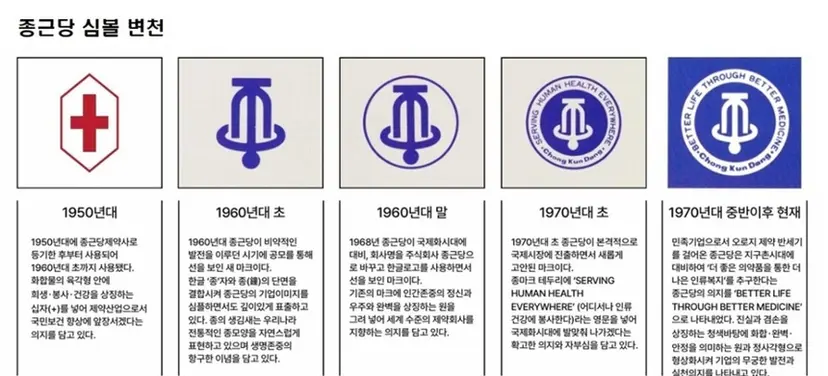
[비즈한국] Corporate CI changes vary greatly depending on the company's philosophy. While some companies completely overhaul their CI within 10 or even 5 years of development, others rarely change an established CI once it has taken root. While it is difficult to simply categorize each case, companies that prioritize consumer trust and possess strong conservative tendencies tend to fall into the latter category. Pharmaceutical company Chong Kun Dang185750, which had not changed its corporate symbol for about 50 years, unveiled a new CI at its 84th anniversary ceremony held at its headquarters in Chungjeong-ro, Seoul, last May.
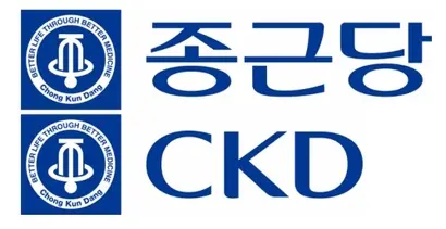
Chong Kun Dang’s existing symbol consisted of the Korean character ‘종’ (Jong) shaped like a bell, paired with a calligraphy-style logotype. The bell-shaped symbol, introduced in 1960, is remarkably modern and intuitive. On the other hand, the ‘Chong Kun Dang’ logotype felt classic, as it utilized the ‘Iljung-che’ typeface by calligrapher Iljung Kim Choong-hyun. This time, Chong Kun Dang retained the bell symbol but replaced the logotype with the newly developed ‘Chong Kun Dang Mirae typeface.’ The Chong Kun Dang Mirae typeface, characterized by a significant difference in thickness between horizontal and vertical strokes, features a Gothic structure with rounded edges added. The English corporate name, ‘ChongKunDang,’ has been abbreviated to ‘CKD’.
Until the 1970s, the mainstream of Korean corporate logotypes was based on calligraphy. The problem with primitive calligraphy logotypes is that their irregular outlines make mass reproduction difficult. This increases the likelihood of design distortion during production by on-site workers and reduces scalability. Entering the 1980s, however, groups of elite graphic designers began to establish rules and introduced results drawn with rulers, compasses, and French curves. Since the 1990s, when computer-aided design became the norm, while there has been no single dominant trend, the number of logotypes that dropped the Korean version in favor of English-only designs has increased significantly.
The introduction of the Chong Kun Dang Mirae typeface is significant in that it narrows the visual gap between the formerly disconnected symbol and logotype, and makes it easier to derive other strings such as Chong Kun Dang Healthcare, Chong Kun Dang Bio063160, and Chong Kun Dang Holdings001630. However, it also has the limitation of feeling dated for contemporary use. The design, which fits Korean characters into a square frame wider than its vertical length and applies partial rounding, is reminiscent of the Korean ‘Graphic’ typeface. It has changed, yes, but the pace is a step behind. It is as if it jumped from the 1970s to the 1980s.
This approach is not necessarily wrong. However, if improvement is desired, two directions can be imagined. One is to move toward a modern Gothic style. The bell symbol already has a shape close to Gothic. By matching the look of the text frame to this, simply setting the frame to be a tall, vertical shape rather than wider horizontally would significantly soften the dated feel. It is also better to give the individual character components—like ㅈ, ㅗ, and ㅇ—a bit of breathing room rather than crowding them too tightly into the square frame. The other direction is to partially improve the original Iljung-che. While calligraphy might be considered primitive, in a situation where calligraphic logotypes have almost disappeared from the industry, it could actually serve as a means to emphasize the company’s roots. Of course, the work of refining the irregular, free-curved lines to have consistency would be necessary.
In a world flooded with CIs that change constantly according to trends, the case of Chong Kun Dang conversely provides food for thought. For those studying brand design or working in the field, it would be helpful to hold discussions on the direction of CI or to try creating redesigns as an exercise.
Who is the author, Han Dong-hoon?
A typeface designer. Interested in all fields related to characters, including writing articles, practicing calligraphy, and designing and teaching typography. Currently, at the typeface studio AlignType, he designs various corporate-exclusive fonts and retail fonts. He has contributed to ‘Monthly Design’ and the quarterly ‘Design Review,’ and conducts typeface design lectures on both online and offline platforms. In 2021, he published the essay collection ‘The Universe within Characters.’