[비즈한국] Is the shelf life of the Sixth Republic system, centered on a single five-year presidential term, finally nearing its end? Following President Park Geun-hye, President Yoon Suk Yeol has also been impeached and stepped down midway due to failures in performing his duties—the second consecutive president from a conservative party to do so—leading to the 21st presidential election being held earlier than scheduled. Major candidates running include Lee Jae-myung (Democratic Party of Korea), Kim Moon-soo (People Power Party), Lee Jun-seok (Reform Party), and Kwon Young-guk (Democratic Labor Party).
A party's name and logotype are keys to understanding its success. The form these take and how long they persist reveal how party officials and the general public perceive that party. The Democratic Party of Korea, launched in 2015, maintained the Gothic-style logotype introduced in its early days but made a change in 2024 by shrinking "Together" (Deobureo) and emphasizing "Democratic Party" (Minjudang).
The previous logotype featured six characters of equal size, whereas the new logotype features a thin, handwritten "Together" placed atop the bold, Gothic "Democratic Party." How should we interpret this change? According to reports, it was candidate Lee Jae-myung, who was serving as party leader at the time, who gave the order to emphasize "Democratic Party." By doing so, he expressed confidence while erasing the traces of his predecessor upon renewing the brand identity. The word "Together" is usually used in an inclusive sense, such as "Together with the weak." Reducing its size could be read as an intention to move beyond the progressive camp and embrace the conservative camp as well.
The People Power Party continues to use the Gothic logotype introduced in 2020. The identity, which had been unstable while transitioning through the Liberty Korea Party and the Future United Party, has been maintained for nearly five years. The driving force behind this was the victory in the 20th presidential election in 2022. However, with the early downfall of former President Yoon Suk Yeol, the key figure of that victory, the identity is now being put to the test. The fate of the People Power Party’s name and logotype seems to depend on whether they remain in power and their future vote counts.
The logotypes for the Democratic Party of Korea, the People Power Party, and the Democratic Labor Party are all thick, Gothic designs that do not break free from the imaginary square frame surrounding Korean characters. The only exception is the Reform Party. They opted for a "break-the-frame" design, where "Reform" and "New Party" are placed at different heights, with the bottom consonants pushed downward. Break-the-frame lettering is more casual than the square-frame style and easier to produce as it requires less structural consideration. It is ironic that the party of a candidate who emphasizes systems and fair competition uses the most unrestrained logotype.
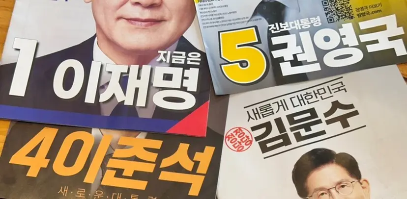
The Sandoll (377300) Gyeokdong (Turbulence) typeface syndrome that swept the political scene for a while is no exception in this election. However, the influx of other typefaces such as G-Market Sans and Sandoll Greta Sans is also noticeable. The Gyeokdong typeface, with its intense, straight strokes, has the advantage of appearing powerful in pamphlets. On the other hand, G-Market Sans, with curves in characters like ㅅ, ㅈ, and ㅊ, looks more flexible than Gyeokdong, while Greta Sans has a higher proportion of curves and includes more empty space within the character frame, making it feel the softest.
Candidate Lee Jun-seok used a Gyeokdong-style Gothic for his name and slogans, while Candidate Kim Moon-soo used Gyeokdong for his name and a mix of G-Market Sans for his main slogans. In contrast, Candidate Lee Jae-myung designed his entire pamphlet, including his name, centered around G-Market Sans, and Candidate Kwon Young-guk used Greta Sans extensively for his slogans. In short, the fonts become softer as we move from conservative to progressive candidates. Additionally, the Nanum Myeongjo font used in parts by Candidate Lee Jae-myung has a progressive and modern feel among Myeongjo fonts, while the Sinmun Myeongjo used by Candidate Kim Moon-soo has a solid look that fills the square frame, creating a strong conservative impression. It is interesting to see how each party's direction is revealed when viewed together.
There is a red triangular point on the bottom right corner of Candidate Lee Jae-myung’s pamphlet. This point is widely used, from banners to campaign jackets. Red is the party color of his opponent, Candidate Kim Moon-soo. The reason for its inclusion is said to be a message of outreach to the entire voter base by using the symbolic colors of both the progressive and conservative sides. Usually, the frontrunner in polls seeks integration, while those trailing seek to consolidate their base. Borrowing the opponent’s color can be seen as a sign of confidence. However, because the placement and area of the red point are subtle, it could backfire, with some interpreting it as an intention to push them into a corner. If the goal was a message of integration, it might have been better to use it more actively without disrupting the center.
Candidates Lee Jae-myung and Lee Jun-seok included messages to voters in the form of letters at the back. Candidate Lee Jae-myung used Nanum Myeongjo. Although it is an off-the-shelf font, it is effective because it is the only Myeongjo-style font used throughout the entire pamphlet (excluding the information disclosure section). On the other hand, Candidate Lee Jun-seok used a font developed based on his own handwriting. While this is not a problem in itself, the statement "I am greeting you with my own handwriting" is ambiguous. Voters with little understanding of digital fonts might mistakenly believe it was written by hand rather than typed on a computer. Depending on how it is viewed, this could be seen as exaggerating authenticity. This is especially true because the developed font seems to have compensated for many of the shortcomings of actual handwriting. The term "handwriting font" can be interpreted in various ways. To avoid misunderstanding, it would have been better to clarify that it is a font. Graphic designer Shin Dong-hyuk has also pointed this out.
While some may consider election pamphlets important and others may deem them trivial, looking at them in detail like this allows one to examine the underlying context. While individual candidates are important, I hope that a culture of voting based on party direction and policy becomes more firmly established, and that the composition and design characteristics of each party’s pamphlets grow in that process. Predicting how the political landscape will change through the election of the 21st president, and what logotypes or typefaces will appear in the next election as a result, would also be a meaningful exercise.