

[비즈한국] Whenever you're with a loved one / Wherever you're having fun / This electric taste, Chilsung Cider / This friendly taste, Chilsung Cider / Always Chilsung Cider...
Launched in 1950, Chilsung Cider is a homegrown carbonated beverage with a history spanning over 70 years. If I had to pick the best CM song for Chilsung Cider, it would be the version sung by Koo Chang-mo and Lee Sun-hee in the mid-to-late 1980s. Its magnificent arrangement and soaring, refreshing vocals pair perfectly with the crispness of the soda. This CM song was remade in 2020, bringing back memories for the generation that lived through those times while offering a sense of freshness to those encountering it for the first time. Even though it utilized a legacy over 30 years old, it didn't feel outdated.
The early symbol of Chilsung Cider, fitting for the name "Chilsung" (Seven Stars), consisted of six small stars arranged around a larger central star. It is estimated that the brand's signature green color was fully incorporated into its cans in the early 1970s. Since then, the brand stuck to a combination of green and white, which evoked a sense of freshness, and underwent a transformation in 1987 with a new design that included a Hangul symbol. The logotype, previously written in a thick Gothic font without a unified design, was also standardized at this time (the Chilsung Mall website cites 1994, but that is incorrect information). In 2000, a complete renewal shifted the focus of the BI from Hangul to English. These are all designs that have shared in the joys and sorrows of our lives.
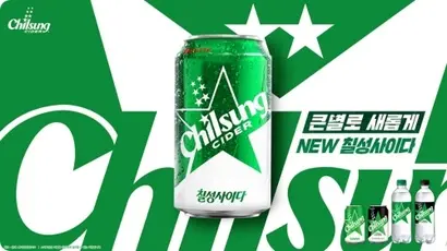
Chilsung Cider’s appearance underwent another major change late last year. Lotte Chilsung Beverage renewed the BI and packaging for the first time in 24 years since 2000. They enlarged the signature star and placed the logotype diagonally across its center, turning the whole design into a single symbol.
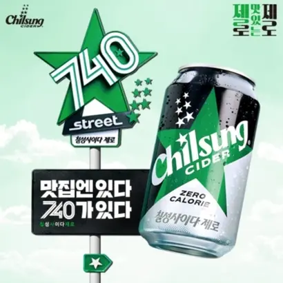
A notable effect of adopting this new BI is the establishment of a system. The Hangul "Chilsung Cider," designed to match the English "Chilsung," is now being derived into "Chilsung Cider Zero." Looking at the logo for the "740 Street" pop-up store held by Chilsung Cider in Seongsu-dong, Seoul, the arrangement of the large central star and the font placed over it functions as a template. The combined star and logotype have been used in various ways, from take-out cups to staff aprons. As a result, the visual connection between the main BI and its related derivatives has been strengthened.
The new packaging design simplifies elements to increase cohesion. However, I can't help but feel it has become a bit too flat. With the decreased prominence of Hangul and the disappearance of gradients, the sense of depth has been reduced. Thinking of the many stars embossed on old Chilsung Cider bottles, the mere seven stars on the current cans look somewhat empty. Of course, integrating the two concepts of "stars" and "seven" intuitively into the BI may have made this inevitable, but the feeling of emptiness is hard to ignore. The logotype, changed to a thick sans-serif, has simply buried the various possibilities held by the string "Chilsung Cider." This has resulted in a look similar to its competitor, Sprite. If Chilsung Cider were a follower, it might be fine, but for an undisputed leader, it doesn't feel quite right.
Perhaps the answer to differentiation already exists within the visuals the brand has traversed? The symbol developed in 1987 by Seoul Graphic Center (Director Kwon Myung-kwang) emphasized refreshment by treating the string "Chilsung" with intense, zigzagging diagonal lines, utilizing the fact that the Hangul consonant "ㅅ" (s) can be visually substituted with the English "S." Since this was significant as the first symbol to use Hangul as its main feature, reinterpreting it could have highlighted the brand's image as the foundation of Korean soft drinks. If they are determined to stick with English, it would be worth considering utilizing "Cider" again, as seen in the 2000 version. While "Chilsung" is important, "Cider" is a word that cannot be cast aside.
Just as the previous packaging lasted for over 20 years, I hope this minimalist new packaging won't be a one-off design. That said, it would be perfect if they added just one more sip of that sparkling personality to the next iteration.
Who is the writer, Han Dong-hoon?
A type designer. He is interested in all fields related to letters—writing, calligraphy, designing typefaces, and teaching. Currently, he works at the type studio AlignType, designing various corporate-exclusive fonts and retail fonts. He has contributed to publications such as 'Monthly Design' and the quarterly 'Design Review', and conducts lectures on type design on both online and offline platforms. In 2021, he published the essay collection 'The Universe Inside Letters'.