

[비즈한국] Although it depends on the concept, it is generally safe to design Hangul logos by simplifying them if they are complex, or by making them flamboyant if they are simple. Because Hangul contains more strokes per character than the Roman alphabet (English), adding even a single differentiating element can make that element seem much more prominent within the character string than expected. The opposite is true for simple strings. Hangul is inherently a geometric script that is already so simple it can hardly be made simpler. Therefore, further simplifying its design can result in a blurred identity.
Dessert café Sulbing recently introduced a new BI through a brand renewal. The main concept is 'Sulbing, where happiness is piled up.' The biggest change in the BI is in the Hangul portion. While the previous 'Sulbing' Hangul was reminiscent of free-form brush calligraphy, the new BI has been refined into a simpler form closer to a typeface. The previous logotype was difficult to evaluate positively because the stroke weight was not clear and the form was complex, but it has been significantly cleaned up.
However, it would have been better to retain some 'dry brush' details for the sake of continuity with the previous calligraphy. Another flaw is that the typeface for the 'KOREAN DESSERT CAFE' text above the symbol does not match the English 'SULBING' font. The best approach would be to develop a dedicated typeface that aligns the Hangul and English designs for consistent application. One could also imagine a scenario where a calligraphic font based on the 'Sulbing' symbol is developed and distributed for free, as fonts are powerful branding elements that can permeate a consumer's daily life without resistance.
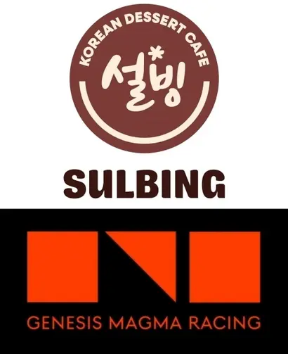
The opposite case is Genesis Magma Racing. Genesis Magma Racing is a racing team established by Genesis, the premium brand of Hyundai Motor Company005380. It is a manifestation of Genesis's ambition to establish a footprint in motorsports while aiming for a premium image that stands shoulder-to-shoulder with the world's leading luxury brands. They chose orange, a color that conveys a high-performance image, as the main brand color and developed a dedicated BI. The hypercar GMR 001, unveiled for WEC participation, creatively applied the signature Genesis 'two-line' identity from the front to the side.
The issue lies in the main symbol. The symbol, which is said to be derived from the initial consonants of 'Magma' (ㅁㄱㅁ), is overly static and fails to convey the sense of speed necessary for a high-performance image. As noted above, if Hangul is approached solely through minimalism, it becomes a featureless and meaningless shape. Furthermore, the consonants 'ㄱ' and 'ㅁ' are among the characters with the least visual distinctiveness in Hangul.
A hurdle in developing Hangul logos is the presence of terminal consonants (batchim). The 'Magma' string, which has a symmetrical form without terminal consonants, had good potential. What if, instead of simplifying 'Magma' by reducing it to just its initial consonants, they had expressed the strokes by dividing them into two lines to highlight the Genesis identity or incorporated the curves of a track? Designing the characters of 'Magma' closer to a cursive script could also have been a solution. The current symbol seems to have trapped its potential ideas within a square and a right-angled triangle.
The Genesis Magma Racing team is steadily advancing toward the top, recently winning the opening round of the European Le Mans Series (LMP2 class). However, in contrast, the symbol applied to the race cars actually running on the circuit appears clunky and far removed from aerodynamics. It seems necessary to develop a more sophisticated symbol in the future that takes Hangul as its motif.
Designers are beings who struggle for a good draft anywhere, anytime. Although English-based BIs are dominant these days, I hope designers will enrich the visual environment by developing creative forms using Hangul as material.
About the author, Han Dong-hoon:
A typeface designer. Interested in all areas related to characters, including writing, calligraphy, font design, and teaching. Currently designs various corporate-exclusive fonts and retail fonts at the type studio AlignType. Has contributed to 'Monthly Design' and the quarterly 'Design Review', and conducts typeface design lectures on both online and offline platforms. Published the essay collection 'The Universe Inside Letters' in 2021.