

[비즈한국] Korean Air003490 recently hosted the 'KE Rising Night' event at its headquarters hangar in Gangseo-gu, Seoul, where it unveiled a new CI and aircraft livery design that differ significantly from its predecessor. Following the filing of a similar logo with the Korean Intellectual Property Office in early 2022, there was much speculation about a potential rebranding; the official announcement maintains the major framework. This CI change, the first in 41 years, is heavily aimed at the full integration with its subsidiary Asiana Airlines, which it acquired last year.
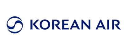
The previous logo, unveiled in 1984, served as the face of Korean Air for a long time, paired with the sky-blue fuselage paint. The Taegeuk symbol naturally incorporated into the ‘KOREAN AIR’ text represented the high-speed rotation of aircraft propellers while expressing Korean Air’s identity as the flag carrier. Among the Korean, Hanja, and Latin alphabet logotypes, the Latin alphabet version—which is thick and soft, conveying a sense of weight and a classic image—was the most widely used.
The core of this CI change lies in the symbols, logotypes, and the introduction of a dedicated Korean typeface. For the symbols, the design shifted from large areas of color to narrow lines, and the color was unified into a single dark blue. The logotype, inspired by the curves of the Taegeuk pattern, features soft curves on the ends of strokes in letters like 'K' and 'R' that would otherwise end in diagonals, reflecting the nature of the industry. The dedicated typeface linked to the logotype is also based on a clean Gothic style, incorporating the rounded elements derived from the Taegeuk pattern into major strokes. The simultaneously announced pictograms also apply similar design characteristics to ensure consistency among characters.
The changed CI has both positive and negative aspects. The old logotype had weak visual connectivity because the designs and weights of the Korean/Hanja (대한항공/大韓航空) and Latin alphabet (KOREAN AIR) were inconsistent. While it is good for a developed CI to last a long time, it needs to be updated to match the times if it has been used for an extended period without intermediate renewals. Visual unification was a necessary task at a time when the two companies are merging to take a leap forward. Overall, the symbols, logotypes, and dedicated typefaces are linked without major issues, successfully integrating the key visual elements that had previously been used inconsistently. The aircraft livery, which has become calmer by adding a pearl effect to the existing sky blue, has lost some of its playfulness but is much more sophisticated, achieving harmony with the new CI.
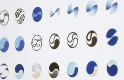
The negative aspects relate to details. The new symbol, said to be hinted at by the ribbons of a 'sangmo' (a hat used in traditional Korean folk dance), raises the question of whether this is the right era for 'sangmo-nori' references, even considering its status as Korea's largest flag carrier. It is unfortunate if the only reference that can be brought in for the symbol of a 21st-century Korean airline is traditional culture. Even considering that big brands of a certain scale are limited to symbols with high, easily recognizable awareness, it leaves something to be desired. Furthermore, the smooth curvature of the symbol's left and right ends—a crucial aspect—feels pointed, as if the handles of a pen tool were not fully pulled in digital drawing. The dedicated Korean typeface also shows significant variations in character width by syllable block, suggesting room for future improvement.
Korean Air's CI change has sparked much debate, commensurate with the symbolism of the airline. However, it is clear that the direction of the change is the right decision, aligning with global sensibilities. Ideal corporate identity management involves maintaining a consistent direction over the long term while adding timely touches. In other words, it is not completed from the start but becomes stronger through continuous refinement. If the old CI, used for 41 years, was utilized without major changes, one hopes that this new CI will strengthen its quality and identity through continuous renewal while maintaining its major framework for the next 40 years.
About the author, Han Dong-hoon:
Type designer. Interested in all fields related to letters, including writing, calligraphy, designing type, and teaching. Currently working at the type studio AlignType, designing various corporate-exclusive fonts and retail fonts. Contributed to ‘Monthly Design’, the quarterly ‘Design Review’, and conducts type design lectures on on/offline platforms. Published the essay collection ‘The Universe within Letters’ in 2021.