[비즈한국] Daum, long considered one of Korea's leading portal sites alongside Naver035420, has changed its logo for the first time in 12 years as part of a complete app revamp. The Content CIC (Company-in-Company) of Kakao035720, which manages Daum services, stated that it changed the previous logo—which was complex with mixed colors and varying heights—to a simpler and clearer version.
Daum's beginnings were closely tied to art. Its history began in 1995 with the establishment of Daum Communications by Park Keon-hee, who majored in photography, and Lee Jae-woong and Lee Taek-kyung, who came from computer science backgrounds. The company name "Daum" carried dual meanings: preparing for the "Next," and the harmony of diverse sounds (多音). Daum’s first services were focused on cultural and artistic content, such as a virtual gallery where users could view works by artists, and live streaming the 1995 Gwangju Biennale on the internet for 24 hours, which drew significant attention. Later, it launched Hanmail, the first email service in the country to offer free lifetime access, gaining massive popularity. By the early 2000s, its internet cafe service became a hit, propelling Daum to become an absolute powerhouse in the portal market. However, from the mid-2000s, it began to decline as it was pushed aside by Naver, which led the way with services like Knowledge iN and blogs. The demand for Daum Cafe, its flagship service, was also gradually absorbed by Naver Cafe.
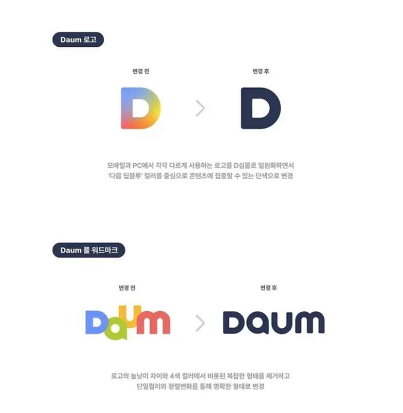
Logos tell us many things. In particular, the logo of an internet service always occupies a prominent position on the screen. The logo trend in the internet industry is not much different from other sectors. Looking at brands within the same industry, most use logos featuring plain sans-serif letters lined up in a row. Naver has maintained a consistent design since 2001, with only minor details changing, and the Google logo, which held onto a thin serif for a long time, also changed to a relatively plain sans-serif in 2015. Kakao and NHN181710 are the same. Now, the Daum logo has been added to this procession.
The biggest problem with the new logo is that it is hard to read. The new logo takes the previously clustered characters and spreads them out in a line; however, the "A" in the middle can be misread as an "O" or a "Q." The original "A," while slightly lacking in readability, was accepted as a "graphic to be viewed" rather than just text, so it was not a major issue. But with the letters separated, the "graphic to be read" quality required for typography is emphasized, exposing the flaws of the "A." Unlike the original design, which had sharp, angled corners, the new version uses curves to create a softer look, which is also unsuccessful. The viewer's gaze, while reading "DAUM," does not stay focused until the end but instead slips off the top and bottom as if sliding on ice. It would have been better to adopt an entirely new typeface.
I also wish the colors were changed to a brighter tone. The color is described as "Deep Blue," but there are many variations that can be expressed under that name. Currently, it looks like a blue close to black, giving it a very dark feel. There has been noticeable negative feedback from users—both online and offline—who remarked that they thought something bad had happened. Even if not as bright as Facebook's shade, a blue with higher brightness could still convey trust.
Daum, having discarded the "diverse sounds" that its logo once proclaimed, now faces the dilemma of needing to break through its current sales decline with diverse services. The previous Daum logo was the only one in the Korean portal market that "stood out." The fact that they have abandoned this is a symbolic gesture indicating they intend to follow the current trend. Its presence and service usage continue to dwindle, with no signs of a rebound. What will become of the future of Daum, which has shed its last remaining personality in favor of the ordinary?
About the author, Han Dong-hoon:
A typeface designer. Interested in everything related to lettering, including writing, calligraphy, designing typefaces, and teaching. Currently, he designs both corporate-exclusive fonts and retail fonts at the typeface studio AlignType. He has contributed to publications such as 'Monthly Design' and the quarterly 'Design Review,' and conducts typography design lectures on both online and offline platforms. In 2021, he published the essay collection 'The Universe Inside Letters.'