

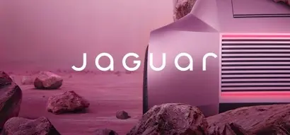
[비즈한국] Ahead of the electrification of its flagship models, the British premium automotive brand Jaguar has embarked on a rebranding, unveiling a new brand identity (BI) and a teaser video as part of the initiative. The core of the new BI consists of a logotype called the 'Device Mark,' a 'Strike-Through' graphic featuring a negative-space silhouette of a jaguar within a horizontal line, and an 'Artist Mark,' a symbol that encloses the first and last letters of the brand name, J and R, within a circular border.
Unlike the previous logotype, which was characterized by its linear style and sharp contrasts in stroke thickness, the new Jaguar logotype has been redesigned with a rounded, softer look. While there is much debate surrounding this rebranding, which completely overturns the brand's established direction, the general sentiment appears to be negative. The teaser video, which hardly resembles content from an automotive brand, has also been met with a barrage of criticism. This is because it features a variety of people and slogans, yet fails to capture any of the characteristic traits historically associated with Jaguar.
Two past examples come to mind regarding Jaguar's changes. The first is the switch to rectangular headlamps on the XJ model. The XJ, Jaguar's flagship and symbol, originally featured two pairs of round headlamps. However, when the XJ (XJ40) underwent a full model change in 1986, it adopted plain rectangular headlamps instead of the round ones. Enthusiasts protested vehemently. While one might wonder why the design of a lamp matters so much, as seen in the case of the Porsche 911 in the late 90s—which faced criticism when it changed its headlamps from oval to free-form shapes—even the slightest change to a flagship model of a heritage-rich premium brand can swing between extreme praise and sharp criticism. Jaguar eventually returned to round headlamps with the next-generation XJ (X300).
The second example is the comprehensive styling change led by former design director Ian Callum. The C-XF concept car, unveiled in 2007, signaled a shift for Jaguar with a radical exterior that looked completely different from its predecessors. In particular, it abandoned the dual round headlamps and vertical radiator grille that were considered symbols of Jaguar, with the sleek, refined front end signaling a clean break from the past. However, unlike the previous incident, this was accepted as a constructive break. The slim integrated headlamps and the tense side beltline were noted for stripping away the archaic luxury car image and boldly revealing the brand's inherent racing DNA.
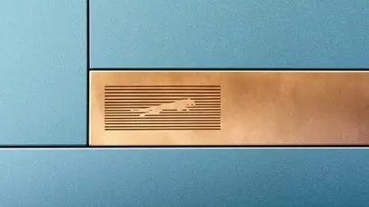
The scope of change is growing ever wider. This time, the brand has completely upended the foundation it has maintained since its inception, including the exterior design of its vehicles. For an automotive company, this direction might seem baffling. However, from a 'fashion' perspective, one reaches a different conclusion. The horizontally arranged Device Mark and the circular Artist Mark are reminiscent of those from brands like Gucci or Louis Vuitton. The colors, such as Miami Pink and London Blue, and the teaser video—things that Jaguar enthusiasts could never have imagined—become understandable when viewed through the lens of the fashion industry.
Jaguar intends to significantly raise the prices of its new cars in the electrification era to compete with high-end brands like Porsche and Bentley. The characteristics of electric vehicles and the transportation culture they will create differ from internal combustion engine vehicles in many ways. Rather than the joy of maintenance and mechanical sensibility, convenience and comfort as a massive electronic device are emphasized. Those in charge of the rebranding seem to have set Jaguar's course in the electric era closer to that of an ultra-luxury fashion brand.
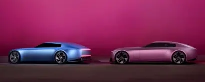
Jaguar officials surely knew the criticism that would follow this announcement. Is this self-destructive innovation, or a misstep that will pull down a brand that was developing smoothly? The real test starts now. Whether in automobiles or fashion, the only answer is to push forward with determination. However, since the main product is ultimately an automobile, success will be difficult unless the vehicle's driving performance supports these significantly elevated goals.
Who is the author, Han Dong-hoon?
A type designer. He is interested in all fields related to letters, including writing, calligraphy, and designing and teaching typography. Currently, he designs various custom corporate fonts and retail fonts at the type studio AlignType. He has contributed to 'Monthly Design' and the quarterly 'Design Review', and conducts typography design lectures on both online and offline platforms. In 2021, he published the essay collection 'The Universe Inside a Letter'.