

[비즈한국] ‘Design’ is a broad term that encompasses many specialized fields. Among them, logo design is a representative area that even non-experts can immediately identify. As the most powerful visual language capable of explaining an organization’s philosophy and direction, logos existed throughout our lives long before the modern concept of identity design took hold, and they will continue to exist in the future.
As important as good design is the proper utilization and preservation of designs that have already been developed. The aesthetic eye and technical skills of designers active in Korea are on par with global standards. However, if someone were to ask whether the preservation and research inheritance of existing works are being done well, the answer would not come easily.
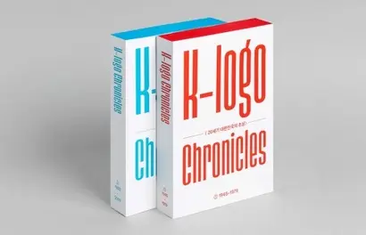
‘Chronicles of K-Logo: Portraits of 20th Century Republic of Korea,’ a book recently published through a collaboration between Studio Magam (an imprint brand of Monthly Design) and CDR (a firm specializing in corporate identity), provides a sufficient answer to this question. Spanning from 1945, right after liberation, to 1999, the final moment of the 20th century, ‘Chronicles of K-Logo’ compiles over 3,000 logos into two volumes. By adding appropriate explanations and articles, it goes beyond a simple archive book to help readers comprehensively understand the changing eras of society.
Given the nature of the design field, which is always intertwined with society, there are diverse behind-the-scenes stories associated with these logos. One feels sorrow for the designer who died young without seeing the success of the Paralympics logo they created, while the project for the Party for Peace and Democracy—where the designer, feeling like an independence activist, sent staff home and worked alone to maintain secrecy—offers a glimpse into the grim nature of that era. Using the term "independence movement" is no exaggeration. It is well known that the Reunification Democratic Party struggled to find office space due to police surveillance and repeated refusals from landlords at a time when opposition parties faced much harsher suppression than they do today. In the section on the Korea Water Resources Corporation (K-water) logo, there is a note that the use of ellipses was more popular in the 80s than the 70s—a detail that only a designer well-versed in the practical work of that time would know.
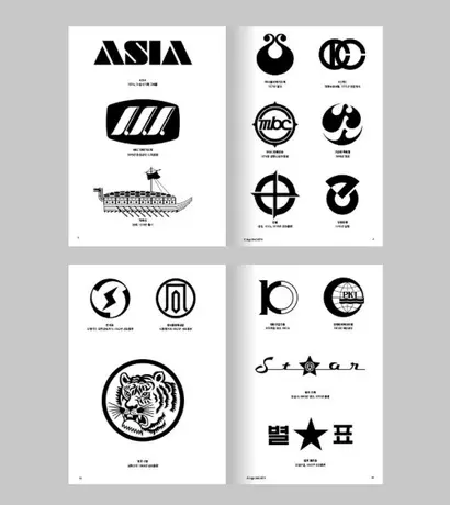
Watching the feast of logos appearing across all sectors, personal memories intertwined with them automatically play back. In the mid-1990s, Korea was in a fierce competition with Japan to host the 2002 World Cup. The logo for the bid featured a design where the two zeros in ‘2002’ were replaced with a Taegeuk pattern and a soccer ball. This somewhat crude but earnest logo was printed on common soccer balls rolling around neighborhood lots in the mid-90s, deeply permeating the subconscious of children playing with them. On the other hand, the first logo adopted by Asiana Airlines020560, which depicts a person’s profile and even their arm, feels a bit excessive in its detail. Yet, it is fascinating that when using Asiana back when this logo was in use, I never really felt it was awkward.
One point I would like to mention is the quality of the included images. To include collected logos in a book in black and white, secondary processing is required. From the perspective of a typeface designer whose primary job is drawing black-and-white outlines, it is noteworthy that there are no awkward parts in the outlines of the numerous logos featured in ‘Chronicles of K-Logo.’ I have often seen cases where outlines were ruined or subtly changed from the original due to a lack of competence during digitalization. In those instances, I had somewhat resigned myself to it being unavoidable. However, the reproduction of the originals in ‘Chronicles of K-Logo’ is highly reliable.
Before opening the first page, I considered ‘Chronicles of K-Logo’ a specialized design book for majors. Of course, that is not wrong. However, after closing the final page, I think it would be great if it became a general cultural book for everyone. The true value of ‘Chronicles of K-Logo’ lies in the fact that it is useful for experts while still providing enough resonance for general readers. I hope that this book serves as a starting point for more highly dense archival books to emerge in other design fields as well.
About the author, Han Dong-hoon:
A typeface designer. He is interested in all areas related to letters, including writing text, hand-lettering, designing, and teaching. He currently designs various corporate exclusive fonts and retail fonts at the typeface studio AlignType. He has contributed to publications such as ‘Monthly Design’ and the quarterly ‘Design Review,’ and conducts typeface design lectures on various online and offline platforms. In 2021, he published the essay collection ‘The Universe Within Letters.’