

[비즈한국] The 2024 KBO Korean Series featured a showdown between the regular-season champion Kia Tigers and the Samsung Lions, who advanced after defeating the LG Twins in the playoffs. It was the first time in 31 years, since 1993, that these two teams met on the Korean Series stage. The most intense period of rivalry between the Tigers and the Lions was from the late 1980s to the early 1990s. The Haitai Tigers, the predecessor to the Kia Tigers, faced Samsung three times—in 1986, 1987, and 1993—dashing Samsung's championship hopes each time. In particular, the 1986 and 1987 series ended in overwhelming victories for Haitai, and in the 1993 series, although Samsung led with 2 wins, 1 draw, and 1 loss by Game 4, they lost games 5, 6, and 7 to finish as runners-up once again.

The most striking element in game footage from 1993 is the uniform design. The front of the uniforms features large lettering of the parent companies' names: "Haitai" and "Samsung." Haitai used the Hangul logotype of Haitai Confectionery as it was, while Samsung followed an independent design created by Design Park. The dynamic letters, crafted by professional designers, still look sophisticated even today. At the time, Design Park was responsible for establishing the visual identities of several teams, not just Samsung.
Back then, the league included not only Haitai and Samsung but also many teams using Hangul logotypes, such as the Binggrae Eagles, Pacific Dolphins, and Chungbo Pintos. However, this trend began to shift from the mid-1990s. While it is unclear whether it was due to the influence of President Kim Young-sam's globalization policy, Hangul gradually disappeared from team logotypes, replaced by the Roman alphabet. Haitai and Samsung also adopted alphabet logos for their uniforms in the mid-1990s, and the Hyundai Unicorns, which acquired the Pacific Dolphins, used an alphabet logo from the start. This appears to be a result of the pro baseball clubs' Brand Identity (BI) trends following the changes in corporate BI.
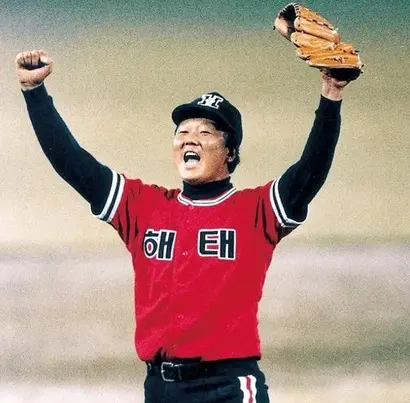
For baseball team emblems or uniforms, a letter design that spreads horizontally is ideal, as it allows for balanced placement in a single line. The alphabet, being phonetic, is advantageous for this type of design, whereas Hangul, with its syllabic block structure, can be relatively disadvantageous. For instance, the old Haitai and Samsung uniforms only had two characters, which felt somewhat sparse. The fact that the US and Japanese leagues, which the Korean pro baseball league modeled itself after, primarily use alphabet logotypes also served as a factor limiting the use of Hangul. However, as long as the team name is not too short, a dynamic, wide-spreading design can be fully achieved even with Hangul cursive. In cases like "KT Wiz," which is short, placing the logo in the upper right corner, as seen in the old LG Twins uniforms, is one effective method.
It has been 42 years since professional baseball launched in Korea; its history is no longer short. Yet, team designs still leave an impression of imitating foreign leagues, particularly those in the US and Japan. While it is not necessary for all teams to use Hangul logotypes, I would like to see a landscape where various character designs coexist rather than being skewed toward the alphabet. If applying Hangul designs to home uniforms is difficult, it would be great to boldly adopt Hangul-centered designs for away or event uniforms. Baseball has firmly established itself as a popular professional sport in Korea. It is my hope that our unique cultural colors will be more deeply reflected in related designs to match that status.
About the author, Han Dong-hoon?
A font designer. He is interested in everything related to letters, including writing, calligraphy, designing typefaces, and teaching. Currently, he designs both corporate-exclusive and retail fonts at the font studio AlignType. He has contributed to publications such as 'Monthly Design' and the quarterly 'Design Critique,' and conducts font design lectures on various online and offline platforms. In 2021, he published the essay collection 'The Universe in Letters.'