

[비즈한국] Successful companies possess a consistent and clear brand identity. In business, branding serves as a tool to convey a company’s message. Among these tools, UI (user interface) design plays a crucial role in managing the visual elements of a brand. The branding strategy of Plus X Creative Director Jang Ki-won can be summarized as "persuasion"—the act of persuading clients, colleagues, and oneself.

Creative Director Jang Ki-won has been leading projects to create user experiences at brand experience design firm Plus X for over 10 years. Standing as a speaker at the ‘BrandBiz Conference 2024’ on the 17th, Director Jang introduced case studies of UI design projects carried out in the commerce sector.
In his project with HANDSOME020000’s online select shop ‘EQL,’ he deliberated on maintaining three core aspects. As a platform that offers brand-specific styling, the goal was to provide curation to users while simultaneously strengthening the brand identity. “From a design perspective, we considered what to keep, what to add, and what to remove,” Director Jang explained. “We maintained high-quality image management while adding style, video, brand, and personalized content to increase diversity. As content types were added, we simplified processes such as product exploration flows.”
For ‘Lazy Night,’ which aimed to be a sophisticated shopping mall for women in their 30s and 40s, the concept envisioned an environment where career women could shop while relaxing in the evening. The core framework of the planning was to keep desired items at their fingertips in a comfortable space. As the weight of the brand image was placed on the space itself, great care was taken in selecting the main typeface. “When working on commerce projects, I place great importance on numerical typefaces,” Director Jang explained. “On content detail screens, we applied gradients and beige tones that suit the 30s and 40s demographic to provide a comfortable atmosphere.” Lazy Night, which Director Jang and his colleagues launched after managing even the front-end development, ceased service this February as the operator, Musinsa, consolidated it with another women’s lifestyle platform, ‘29CM.’
He then introduced large-scale projects conducted with Musinsa and Kolon002020. Musinsa’s UI branding, which aims for a practical platform for daily life, was conducted under the motto of ‘minimal design, maximum functionality.’ Following a request to “not make it look designed,” the direction was intentionally set to avoid mentioning design styles, focusing instead on a simple and refined UI utilizing basic elements. Details such as the size and spacing of typefaces and image elements were treated as paramount. Director Jang said that the most important question was, “What does it mean to be ‘Musinsa-like’?” He applies an architectural approach when working on designs. For Musinsa, he focused on ‘gray,’ inspired by the raw gray walls revealed after stripping away white walls. “I returned to the beginning of Musinsa, which stood for ‘a place with an inexhaustible amount of shoe photos,’” Director Jang said.
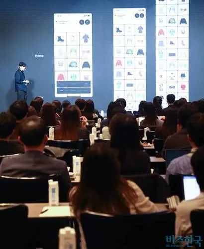
In contrast to Musinsa, which returned to the basics, Kolon faced the challenge of creating more operational elements. Dark plum, a color not found in existing platforms, was used as the base color to express perspective, and a brand renewal was conducted alongside his colleagues. To differentiate from other commerce platforms, ‘switching short-form’ videos were adopted, and panoramic images were applied. The final version was a combination of key elements from a relatively realistic ‘A’ draft and an experimental ‘B’ draft, with brand colors being more actively incorporated in the final stage to strengthen impact. “Maintaining a brand identity is just as important as building it,” Director Jang explained. “We created and provided image guidelines for composition, categorized by portraits (upper/lower body), full-body shots, and product orientation (vertical/horizontal).”
Branding requires a process where the client and the designer continuously communicate and coordinate. Tension always exists between data represented by numbers and design that reveals a company’s identity. “If a business doesn’t survive, the meaning of design disappears. Business is important because design must ultimately be applied to services,” Director Jang noted. However, he also emphasized, “I think if we only create services based on data, all services would end up looking the same. Since the online market is a structure where only the number one player survives, I believe the experience provided to the user becomes the key point. Once a company reaches a certain level, I see it as a battle in the realm of branding.”