

[비즈한국] Disputes over design plagiarism are incessant, regardless of the era or industry. This is especially true now that public awareness regarding copyright has matured significantly compared to the past. The recent first-instance ruling in the lawsuit between Binggrae005180 and Seo-ju offers a glimpse into how the courts perceive the similarity of package designs. The case involves Binggrae’s ‘Melona’ and Seo-ju’s ‘Melon Bar’.
This isn't the first time the two have been at odds. Launched in 1992, the melon-flavored ice cream Binggrae Melona is widely acknowledged as the company's flagship product. Back then, Hyoja-won released a similar product called Melon Bar, and Binggrae filed for an injunction to ban its sale in 2005 but lost. The court reasoned that Melona’s packaging was not enough to call a specific product to mind. After mergers and acquisitions, the Hyoja-won Melon Bar became the Seo-ju Melon Bar (2014), and Binggrae filed another lawsuit citing continued similarities, but failed to secure a favorable ruling this time as well. Binggrae has expressed its intention to appeal the decision.
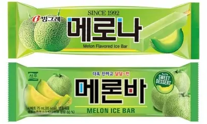
Having lost the case, Binggrae announced its intention to appeal, emphasizing that Melona’s package design is not merely about color, but a combination of design elements including color schemes, image placement, and the font of the ‘Melona’ logo. They argue that this combination is effectively recognized by consumers as Melona, citing its established reputation. Their stance is that while the green color reminiscent of melon may belong to everyone, the resulting design that combines these detailed elements is Binggrae’s own achievement. Meanwhile, the court’s logic remains largely unchanged from 19 years ago: it continues to repeat the argument that it is not in the public interest for any single entity to monopolize the natural colors of a fruit.
The court ruled that since anyone can use the natural colors of fruits for fruit-based products, Binggrae’s packaging is not subject to protection. But what about the logo? The two products are similar not only in color and image placement but also in the font of the logo—the most important element in the center of the packaging that identifies the product to the consumer. The angular Gothic style with enlarged initial characters and added color accents inside and outside the strokes does not seem to have much to do with the characteristics of a melon. If it were truly about a melon, the strokes of the Korean logo would likely be rounded. The accent color, blue, also does not easily evoke thoughts of a melon.
The Gothic-style font of the Melon Bar logo, which matches Melona’s in its black color, white border, and even thickness, cannot be seen as a conventional depiction of a melon. Perhaps conscious of plagiarism, Melon Bar placed the accent inside the internal spaces of the letters rather than on the strokes and used red as an accent color, resulting in a slightly cruder design. There is further circumstantial evidence that the Melon Bar logo was copied from Melona. The characters ‘메’(Me) and ‘나’(Na), which share similar letter combinations, were designed similarly to ‘메’(Me) and ‘바’(Ba). However, for the ‘론’(Ron) part, which includes a final consonant, they could not refer back to the ‘로’(Ro) in Melona, making it look much clumsier. Consequently, the quality of the ‘론’(Ron) in ‘Melon Bar’ turned out particularly low.
The font and layout of the surrounding text in the Melona logo are unique designs unrelated to the actual shape or color of a melon. That Melon Bar has appropriated even this goes beyond the scope of products in the same category; it appears to be an act intended to induce consumer confusion by strongly referencing a competitor and riding on its reputation for unfair gain. The court, which ruled that the Melona packaging is not a unique design of Binggrae, failed to provide proper grounds for this specific aspect. It merely emphasizes the principle that the use of colors on product packaging is free. Judging design similarity requires a comprehensive consideration that includes not only fragmentary elements like color and layout but also the context of the typography design.