

[비즈한국] If you were to ask a Korean what August 15 represents, the first answer for most would be 'Liberation Day.' This is certainly correct. However, this day also marks the beginning of the subway era in Seoul, as the downtown section of Seoul Subway Line 1 was opened. The 'subway' is more than just electric trains and underground tracks; it is a massive, integrated system that accounts for connectivity with other forms of transportation like buses, and includes the stations themselves and the signage within them. As the subway system was established, the need arose for lettering to guide passenger flow and communicate announcements. In other words, a dedicated typeface for the subway interior emerged.
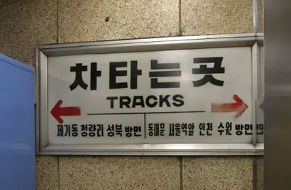
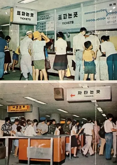
The typeface for Seoul's first subway (metropolitan electric railway) went through two major transformations. At the time of opening in 1974, angular Gothic lettering hand-drawn for signs like 'Ticket Counter,' 'Boarding Area,' and 'Exit,' accompanied by a narrow, rounded Gothic, were used. Because there were no unified design guidelines, the typefaces were produced on the spot as needed at each location. Looking at old photos, one can notice a Gothic typeface with wider proportions on the 'Subway' signs at street-level entrances, distinct from those used inside.
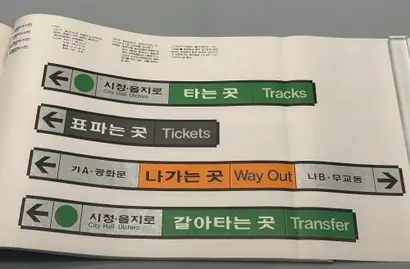
Later, in 1982, modern design guidelines for the subway were introduced, giving birth to the 'Subway Typeface' that many citizens are familiar with. The characteristics of this typeface include rounded corners and a refined design that narrows the thickness of the terminal strokes in characters like 'ㅅ' and 'ㅈ'. Its scope of application also expanded. Until the early 80s, the typefaces used for station entrances, ticket gates, and inside trains were often different, but as the guidelines were refined, most were unified into the Subway Typeface. The emergence of this typeface demonstrated that public design lettering had moved beyond ad-hoc on-site production into the realm of systematic graphic design.
The Subway Typeface, which was used for decades without significant changes until the completion of Line 8, began to lose its status with the advent of the 'Seoul Typeface' in 2008. Starting with Line 9, which opened in 2009, lettering in many renovated stations is being replaced with the Seoul Namsan typeface instead of the Subway Typeface. While the situation varies by station—for instance, the Shinbundang Line, which is not under Seoul city jurisdiction, still uses the Subway Typeface—in the long run, the Subway Typeface seems destined to disappear.
The 70s-era typefaces that remained in various corners of Line 1 stations also disappeared a few years ago following renovations. The whereabouts of this visual heritage are unknown, but it seems unlikely they were sent to a place where they could be utilized in a constructive way. It would be a great loss if they were simply discarded without a plan. While the strategy of unifying designs using a local government's own dedicated typeface is not necessarily bad, it is a pity to completely discard the original lettering when considering the unique, historical nature of the subway space. I have personally encountered foreigners who expressed regret at their removal. If we look beyond Seoul, the early subway typefaces in other major cities like Busan and Daegu also hold significant preservation value. Is there no way to protect them?
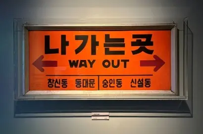
As a typeface designer, one way that comes to mind is to create digital fonts based on photographed materials for various applications. Once the handwritten lettering is incorporated into the realm of digital fonts, it can gain a semi-permanent lifespan as long as the original files are not lost. Of course, a level of restoration that reproduces the original design with absolute precision is not enough. We need to find points for aesthetic improvement or incorporate them into a new context. In the case of the aforementioned Line 1 lettering, the strokes of 'ㅅ' and 'ㅈ' sometimes have excessively protruding terminals; these parts should be adjusted, and a new English typeface that complements them should be created.
The same goes for the Subway Typeface. The reason this font's usability in daily life is low is that its width is wider than the average aesthetic sense of today. In a horizontal writing environment, wider character widths mean that less text can fit on a single line. It is necessary to adjust this to accommodate various purposes and fit contemporary sensibilities. Also, since it was drawn in an era before computers were used for font design, it has the disadvantage of inconsistent stroke thickness across different character groupings, and the English portion, which uses Helvetica, needs improvement to match the Korean characters.
There is a project called 'Metro of Seoul' that archives tile murals installed during the construction of the first generation of Seoul Subway. This project culminated in the 2021 publication of a book titled 'Subway of Seoul.' If official preservation by the local government is difficult, such archiving and inheritance at the private level are possible. Facing the long, 50-year history of subway culture, it is time for us to stop letting design heritage disappear and start considering various ways to preserve it.
About the author, Han Dong-hoon:
A typeface designer. He is interested in all fields related to letters, including writing, calligraphy, and designing and teaching typefaces. He currently designs corporate-dedicated and retail fonts at the type studio AlignType. He has contributed to 'Monthly Design' and the quarterly 'Design Critique,' and conducts typeface design lectures on both online and offline platforms. In 2021, he published the essay collection 'The Universe Inside Letters.'